
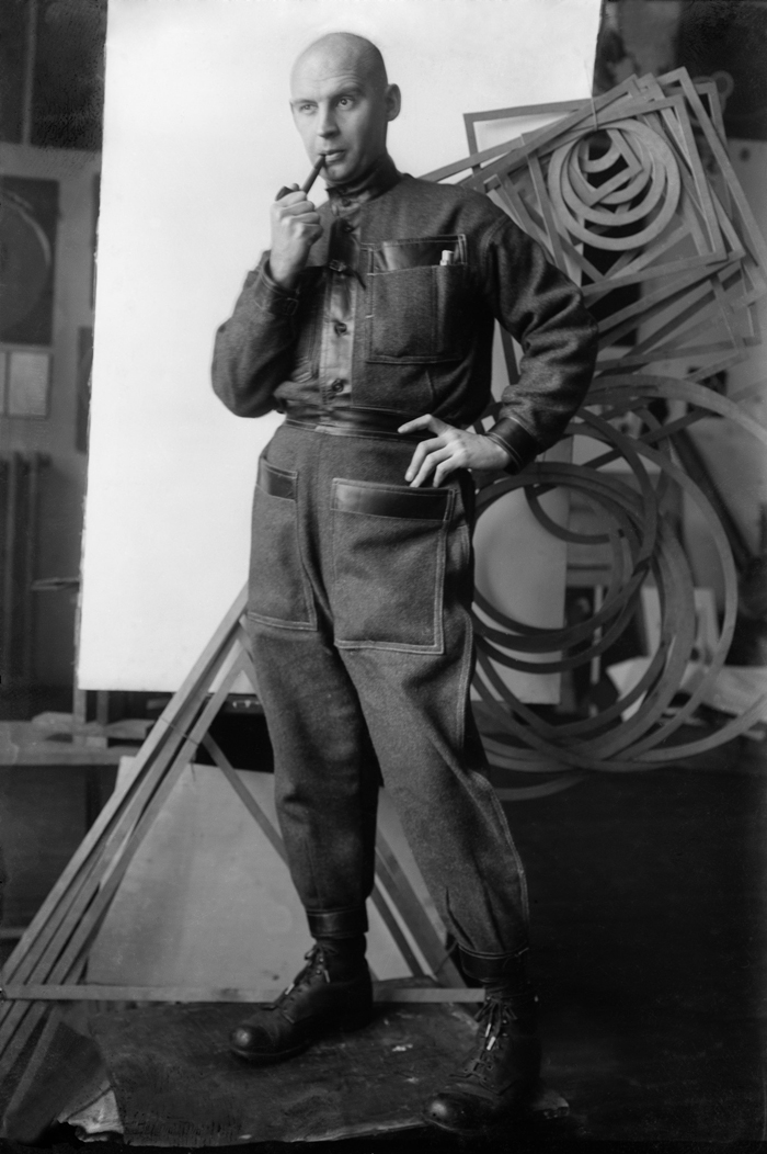
Aleksandr Rodchenko in productivist clothing, 1922–23. Photo by Michail Kaufman. A. Rodchenko & V. Stepanova archive.
Steadily dwindling since the sixties and seventies, the production of monochrome paintings has been resumed in the past few years with that insistent enthusiasm that characterizes the outré. For instance, Eli Langer has taken to only making near-black paintings, Maike Schoorel continues to refine her near-white ones, and in his last show at China Art Objects, Mark Hagen presented a selection of both. And then there are those objects that involve other mediums and materials masquerading as near-black or white paintings: Justin Beal’s plastic wrapped mirrors, Kaari Upson’s cast charcoal tablets, Bobbi Woods’s spray painted film posters, Phil Chang’s unfixed photographs. The list goes on, and it begs the question of why this and why now?
To many of us, the actual work of coating canvases a uniform color is perplexing to the point of absurdity. To the cognoscenti as much as the lay public, it comes shrouded in the thick fog of occult mysteries, while at the same time radiating the light of reason. Since this work comprises so few decisions—proportion, scale, preparation of surface, texture—they must all be absolutely “right.” The monochrome exudes a sense of inevitability, as if it could not have been made any other way, and one can be wholly convinced of this without quite knowing how to take the measure of its “rightness.” Are the criteria universally set or idiosyncratically chosen? Depending on where one stands, that is, the monochrome is either the selfless fulfillment of a reductive process that answers only to the command of history, or else it is the last gasp of the solipsistic ego that has been chasing its tail for too long. Of course, there are many more ways to get at it—literally, no end of ways. In this regard, the monochrome is the epitome of the open work, but it does not follow that it is therefore generous, agreeable, or even remotely user-friendly. The opposite is true, and this is where the difficult figure of the dandy comes in.
In his Artforum essay of 1988, “Dandyism and Abstraction in a Universe Defined by Newton,” Carter Ratcliff attempts the near impossible task of explaining one highly ambiguous concept by recourse to another no less ambiguous one.1 No doubt, the problematic, even self-sabotaging character of this operation is undertaken as explanatory in its own right, as it highlights a recessive trait shared by his proposed topics: dandyism, abstraction and, at the extreme, the monochrome painting. More to the point, he wants to rethink what a monochrome painting is by relating it to the dandy, who likewise tends to elude consensual definition. To some, the dandy is a sharp dresser, to others, archly out of fashion; to some, the dandy is narcissistic, to others, devoid of self; to some, the dandy is challenging the status quo, to others, capitulating. In casual talk, the designation promises a pinpointing particularity that is never quite delivered upon, and in this respect, dandyism is very much like monochrome painting—both want to keep us guessing.
The dandy shares with the monochrome painting a condition, or sensibility, that we tend to associate more with our past than our present-day circumstances. Both are theoretically linked to the experience of modernity, and are rarely discussed outside a context that would, by now, have to be recognized as academic. In practice, however, monochrome painting and dandyism remain entirely viable options, perhaps more so than ever before. Observed in isolation, it is the determined and declarative aspect of each that predominates; in tandem, however, they exude a highly charged reticence. Ratcliff defines their common affect in terms of “inertia,” “vacuity,” and “blankness.” Both seek to disengage from the causal laws of the workaday world, while remaining nevertheless productive. At the end of the day, that is, something does get made—a work, a look, the self as object—and with single-minded devotion. The evacuated expression that they share gives form to an ambivalence that is very much of the moment.
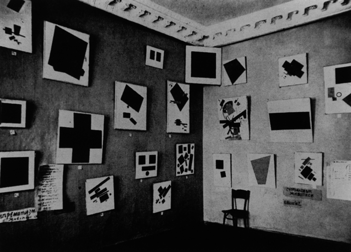
Photograph of work by Kazimir Malevich in The Last Futurist Exhibition “0.10,” Petrograd, 1915.
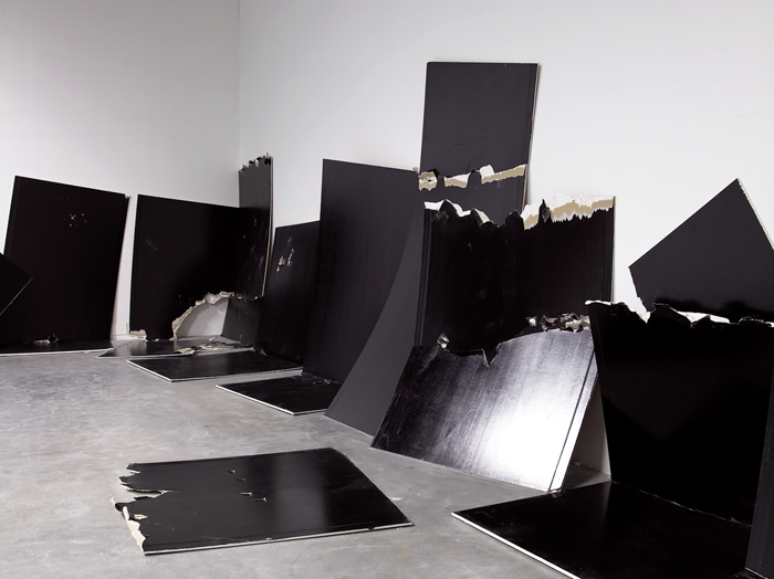
Steven Parrino, 13 Shattered Panels (for Joey Ramone), 2001. Thirteen standard panels of gypsum plaster board painted with black industrial lacquer. Dimensions variable.
Ambivalence is there from the outset, of course. The conflicting theorizations of painting’s zero-degree proposed by Kazimir Malevich and Aleksandr Rodchenko, as well as their practical demonstration of their respective positions in both their art and their lives, enfold the monochrome in an argument at its inception. For Malevich, it is all about the hard work of the “Spirit” tunneling through to the “Absolute,” whereas for Rodchenko, this work is relatively easy and marks the limit of painting’s use-value for the future. On the one hand, then, monochrome painting is a portal, and on the other, an impasse. How do we reconcile these two definitions? Pure pigment promises communicative immediacy while also hinting at cover up, a refusal to speak, and this is made all the more evident when the color (or non-color) is black.
In the black painting, the ambivalence of the monochrome approaches its breaking point. Certainly, this is how New York artist Steven Parrino, a contemporary of Ratcliff who died in a motorcycle accident on the first of January 2005, would like us to think of his work when he writes, “The idea of painting a painting is basically the same as painting a fender. Simple and clean.”2 These words conform to a Constructivist ideal of anti-art efficiency, but then Parrino is also prone to a much more Romantic, even religious, order of explanation: “I have personal reasons for repainting certain paintings BLACK, reclaiming them like so much dead, bringing them power, honor…”3 Between these two statements, the Rodchenko/Malevich argument is resumed and to an extent resolved, because, apparently, it is possible to paint a painting like a fender for “personal reasons.” As Parrino admits further on, he aims to “save” works that “were fucked up in some way” by repainting them black.4 Existing paintings are “blacked out,” but even if nothing was under there, black paintings are always repainted. Parrino in no way refutes the historical arguments that bring painting to its teleological end, but rather accepts that its ground is from the first moment a burial mound, and hence a site to be honorifically commemorated. Black is painted over a history of forms once living, now dead; it declares them dead, but in a way that restores their “power.” “Facing [his] newly risen zombie-abstraction,” the once pure painter of monochromes reemerges as a necromancer, a craftsman of rot.5
Although Parrino’s writings are hyperbolic, to say the least, this redefinition of the monochrome not as the last cry (le dernier cri) of painting, but as one that echoes back from the other side, remains provocative. The pursuit of a singular, grounding truth at the end of the reductive process here gives way to an embrace of radical heterogeneity, or, in Parrino’s words, to “something that is deflated, debased, distorted, contorted, distended, dislocated, removed, bent.”6 A death that will not stay put at the end serves rather to mark a midpoint between material formation and deformation, investing the work overall with an apocalyptic scope.
Parrino tortured his paintings—puncturing canvas like Lucio Fontana or twisting it up like Simon Hantaï—and the results exude both cruelty and a louche downtown glamour. His works are inarguably stylish and play on a connection between monochrome painting and fashion design that also has a long and vexed history. From Rodchenko’s “production clothing” jumpsuit to the Cecil Beaton Vogue spread of models posing in dresses color-coded to the Jackson Pollock paintings behind them to Fontana’s own artfully gouged evening wear, the equation of an aesthetic of essentializing reduction with high-end frivolity has always proved troublesome. Parrino embraced this as well with his distressed, all-black wardrobe, a “look” no less explicitly referential than his repainted monochromes. In fact, in his writings, he furnishes us with a full list of sartorial inspirations that proceeds from Lou Reed to the members of Suicide to the No-Wave bands of the eighties. “All of what I’m writing about here contained a stark kind of minimalism and did not shy away from the dark side,” he adds. “As a matter of fact they [both the artists and the musicians] were into blackness in a big way.”7 Alluding, in the same breath, to the black paintings of Frank Stella and to black leather, Parrino conflates the white cube of the gallery and museum with the sweatbox of the underground club scene. The analogy is visual, but these visuals respond to an aural stimulus. The positing of an intimate relation between visual art and music via the exchange of tone-colors and color-tones is a crucial factor enabling the historical emergence of “pure painting,” and Parrino recapitulates it with a characteristically negative spin. Black, the absence of color, is linked to the atonal realm of feedback. His monochromes are the outcome of an addiction to noise music and the style that comes with it; by his own admission, this artist is a “distortion junkie.”8
The equation of the colorless monochrome and aural distortion is taken up more recently in the category of Black Metal, which has managed to gain a lasting foothold in the art world. This abysmal variant on synaesthesia is acutely registered in the output of the group Sunn O))), for instance. Formed in 1998, their consecutive albums of sub-base drone, White 1 (2003), White 2 (2004), and Black One (2005), could well be riffing on Robert Rauschenberg’s transition between white and black paintings in the early fifties. As it happens, Rauschenberg also reached his zero-degree while bending an ear toward a destruction of the tonal system, under the direction of John Cage, at Black Mountain College. In turn, Cage cited Rauschenberg’s evacuated canvases as the inspiration for his breakthrough anti-composition 4’33”, from 1952, but by this time the linear, cause and effect narrative of American modernism had already begun to unravel toward the hinterlands of post-media.9 And in regard to current musical and artistic production, the question of who got there first is almost irrelevant. Rather, it is the simultaneous emergence of a complex aesthetic sensibility within two distinct registers of sense perception that stands out. What is heard and what is seen is at once stripped down, “simple and clean,” and excessive.
Dispensing with beats, hooks, choruses—all the standardized elements of the popular song-form—the music of Sunn O))) takes Parrino’s “stark kind of minimalism” and its attendant “blackness” to an extreme. What’s left is the low-end thrum of vaguely mutating chord progressions played at a snail’s pace on detuned guitars. Even when a voice or synthesizer is introduced to the mix, it is at the same low pitch as the core instruments, making for a consistent block of sound that is nevertheless densely packed and full of incident. The same logic can be applied to the white or black monochromes, which likewise bespeak not only reduction, but also accumulation and concentration, massing. The painting that is “all of one thing,” in the language of Donald Judd, compels a highly focused sort of looking that will tend to blur around the edges, becoming susceptible to hallucinatory projection. And just as one “hears things” in the monotone, so does one “see things” in the monochrome.
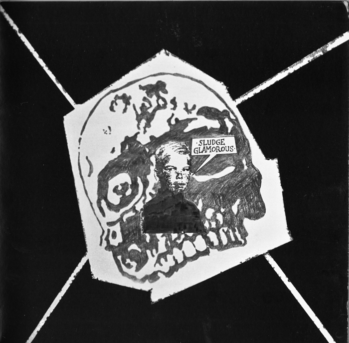
The Melvins, Sludge Glamorous, From the Nursery, 2010. Cover by Steven Parrino.
Between the black and the white, we are left to ponder a host of dichotomies: affirmation and negation, presence and absence, excess and lack. That said, the white and black albums of Sunn O))) feature a more or less uniform sonic palette, suggesting that our ability to distinguish between what has been emptied out and filled up is entirely relative. Cage had come to a similar conclusion, in the early fifties, when he began to experiment with very small and big sounds. Following his often-repeated experience with sensory deprivation in the anechoic chamber—alongside Rauschenberg’s white paintings, a crucial source for 4’33”—Cage turned to the possibilities of extreme amplification. For his part, Parrino linked the two by way of a “shifter,” a metallic grey paint, the color of fenders. White paint radiates light, black paint absorbs it, and grey can do either depending on the angle of illumination and of one’s vision. And the more reflective the paint, the more it will include of its context—the room in which it hangs, the surrounding works, and the viewers passing before it.
The shiny black panels that have long been a staple element of the work of Banks Violette, a self-acknowledged heir to Parrino’s legacy, demonstrate the inherent adaptability of the reflective monochrome to areas outside painting proper. Interchangeably mounted to the wall or laid out on the floor, these reenact the slippage between the virtual and the actual dimensions of the “specific object,” as Judd theorized it, and in particular the leaning plank works of John McCracken. Violette’s flats may likewise be seen as “not-painting” and “not-sculpture,” or a hybrid form comprising characteristic elements of both mediums, but the chain of associations does not end there. The surfaces of these things are buffed to a super-slick, watery finish that darkly mirrors a whole other order of “specific objects,” for the most part the material fall-out from the deep mythological structure of the culture of rock, placed before or atop them. The effect is emphatically set up: every component part of his exhibitions is staged upon or against the monochrome, which accordingly becomes the literal ground of an imaginary production. For instance, the trashed drum-set of Untitled (Model for a Future Disaster), from 2003, appears as the forensic remainder of an increasingly ritualized performance of ecstatic transcendence, basically a prop of rock show theatrics. “I’m interested in a visual language that’s overdetermined, exhausted, or just over-burdened by meaning,” Violette declares in a 2008 interview, and the statement applies to both his fine and popular art sources.10 However, here as well, we reach that point of confusion between a repetition that nullifies its object and one that reaffirms it. Above all, Violette is interested “in how those visual codes can somehow be reanimated.” And then, sounding very much like Parrino, he adds, “All those images are like zombies—they’re stripped of vitality, yet sometimes they get life back in them…and, like zombies, usually something goes wrong when they wake up again.”11
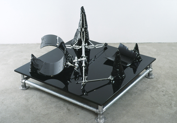
Banks Violette, Untitled (model for a future disaster), 2003. Steel, drum hardware, polystyrene, polyurethane, tinted epoxy; 33 × 48 × 48 inches. Courtesy the artist and Team Gallery, New York.
For his 2006 show at Maureen Paley Gallery, in London, Violette reproduced Sunn O)))’s entire touring arsenal of guitars, amps, and speakers in cast resin and salt, displaying these ghost objects on white panels. In this way, the artist “reanimates” the high culture of a deceased Minimalism by relating it to a lower culture—a subculture—that thrives on death and destruction. When rock-and-roll paraphernalia is reflected in the slick monochrome, both undergo a form of transubstantiation that nevertheless leaves them “wrong.” Accordingly, the figure of the zombie, trapped in a limbo of purposeless self-perpetuation, becomes a negative rejoinder to the “purposiveness” of autonomous art. Within this formulation, the monochrome becomes a cursed object, something that is communicated like
a disease. And as a figure for the artist, who must now face the limits of a practice that drains life from the world in the process of restoring it, the zombie also marks the limits of dandyish ambivalence.
In publicity portraits, Violette seems at once vacant and vulnerable, flaunting a sharp post-punk haircut and tattoos up to the chin. Ratcliff would probably argue that neither Violette nor Parrino qualify as authentic dandies; their style is too beholden to a certain subcultural milieu and is wholly legible through its codes. According to Ratcliff, the point is not to attract undue attention to one’s appearance; dandyism is all about “the maintenance of [a] frozen equipoise” while nevertheless confounding the expectations of onlookers, subtly but decisively.12 Like the monochrome, the dandy’s attire is “a meaning machine designed not to work,” but it could be argued that it is precisely by importing a look “overburdened with meaning” into the scrupulously muted, neutralized precincts of art that confusion is actively courted here as well.13
Whether attention is focused on the noise within silence (small sounds = white painting) or else the silence within noise (big sounds = black painting), the outcome is, at the extreme, identical: over-stimulation and exhaustion. The mind exposed for too long to a concentrated influx of sameness will tend to drift off in search of difference. In regard to present-day prospects of monochrome painting, this distracting function would seem to predominate. Unable to provide any kind of experiential grounding, it prompts its audience to indulge in a process of association that is not exactly free. Time and again, the same analogies reappear in contemporary art: the rocker and the zombie, twin figures of an already obsolete humanity caught in the loop of repetition compulsion that stubbornly persists against all odds.
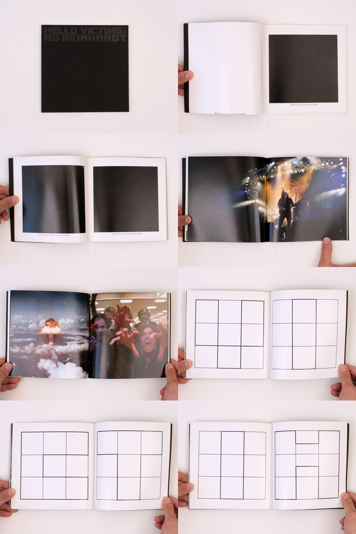
Brian Kennon, Hello Victims: Ad Reinhardt, 2005. Book, 7.5 × 7.5 inches, 44 pages. Courtesy 2nd Cannons Publications.
In 2005, Brian Kennon published Hello Victims: Ad Reinhardt, a book that features black-and-white reproductions of Reinhardt’s paintings set off against onstage shots of the band Motorhead and stills from the 1978 George Romero film Dawn of the Dead. Deprived of its most sensitive aspects—a deeply embedded coloration and evanescent materiality—Reinhardt’s substantive work is reduced to the basics of
its graphic design: the nine-part subdivision of the monochrome’s surface area into the cruciform. This symbol of passionate resurrection, releasing a purified spirit from mortified flesh, is once again subjected to a dismal spin. Like the zombies, that is, these paintings are granted no escape from the mortal coil, which only tightens while slowly sapping their energy. Documents Remain, the title of an exhibition Kennon mounted at BQ gallery in Berlin, in January 2011, and which featured some of the same imagery, delivers the last word on the matter, for at the end of the day, documents are all that remain. Full earthly presence is compressed into the uni-dimensional data of picture and text, which is then left to decay. This holds as true for the form of Hello Victims as its purported contents, which are documents even before the event of their reproduction. Increasingly, it would seem that the rock-zombie/monochrome dyad is held together not only by aesthetic affinities, but also by an historical arc that proceeds all too rapidly from youth to maturity to decline, the last stage drawn out in a potentially endless succession of stylistic revivals.
Revivalism does not promise rebirth or renaissance, which implies a fresh start. Here, instead, whatever is new, or at least novel, is applied atop the old, which tends to seep through. As noted, the monochrome is always repainted; it is painted over its white ground in a definitive manner—in the black painting, it subsumes it—but then it is also painted over every previous monochrome. Even in its thinnest iterations, such as Wade Guyton’s computer-assisted monochromes, layers of historical information accrue. The line of mis-registration that appears between the two passes that the canvas must travel through the printer in order to be filled up, edge to edge, with black ink recalls Barnett Newman’s sublime Zips, as well as Andy Warhol’s more prosaic glitches of man-machine interface. And that is just to cite two of the most obvious precedents, since we could follow this chain of associations all the way back to its first Suprematist and/or Constructivist link. Every next monochrome is automatically tethered to an origin that marks as well the end of painting overall, but again, this is an end that keeps coming.
Memorial urn with Kazimir Malevich’s ashes. Designed and made by Nikolai Suetin. Nemchinovka, 1935. © State Russian Museum, St. Petersburg.
Kazimir Malevich’s coffin, May 1935. © State Russian Museum, St. Petersburg.
On this point it is worth recalling that one of Malevich’s first last paintings was affixed to his coffin as a kind of hood ornament, as if in preparation for a burrowing journey through the underworld. Perhaps Parrino had seen documents of this artifact, which might well have prompted him to compare his own monochromes to both zombies and fenders. From an expanding distance, at a decelerating pace, these are the things that keep coming toward us. One is advised to avoid them, but for this very reason they sometimes still manage to hold us transfixed, prepared to trade in a full but short life for one that is longer because lived half-way, at once here and now and in historical time.
Jan Tumlir is a contributing editor to X-TRA. His book on the artist Matthew Brannon, Hyenas Are…, was recently published by Mousse.